
Sci-Art Lesson Share: Illustrated Graphs
By Cristina Veresan (NOAA Ship Oscar Dyson, 2015)
I remember the first time I saw this simple Venn diagram of “art” and “science” with the overlap of the circles labeled “wonder.” It really resonated with me; while the disciplines have even more in common, I do believe a kind of amazed curiosity is central to them both. Art and science help us make meaning and understand our world in different ways. Whether having students produce mini-documentary films about environmental issues, write personal natural history essays about native species, or sculpt 3-D models of the rock cycle, I strive to meaningfully integrate art into my 5th grade science course.
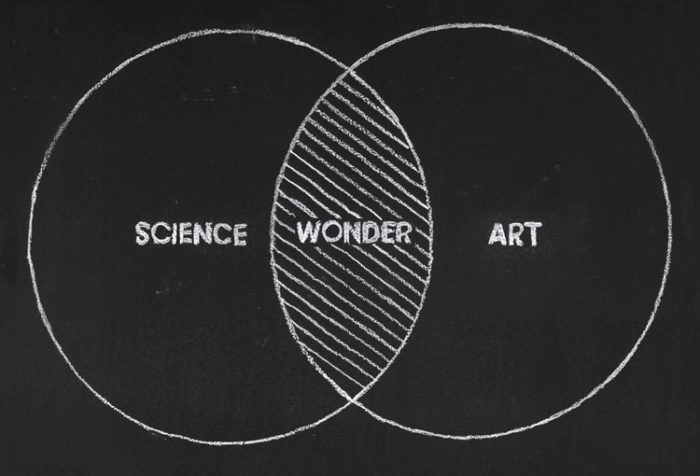
Wonder Venn Diagram by The Imaginary Foundation.
One of the best sci-art lessons I have ever found is Science Friday’s Illustrated Graphs: Using Art to Enliven Scientific Data by educator Ryan Becker. In it, students analyze climate data and incorporate it into original watercolors depicting climate change impacts. The artistic data visualization is brilliant! In 2016, I piloted the lesson, shared my feedback with Science Friday, and eventually collaborated with Ryan Becker on a joint virtual exhibition of our students’ illustrated graphs. I highly recommend this climate data art project for upper elementary and secondary students.
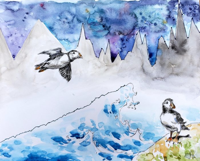
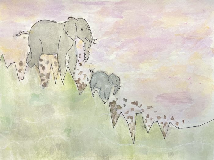
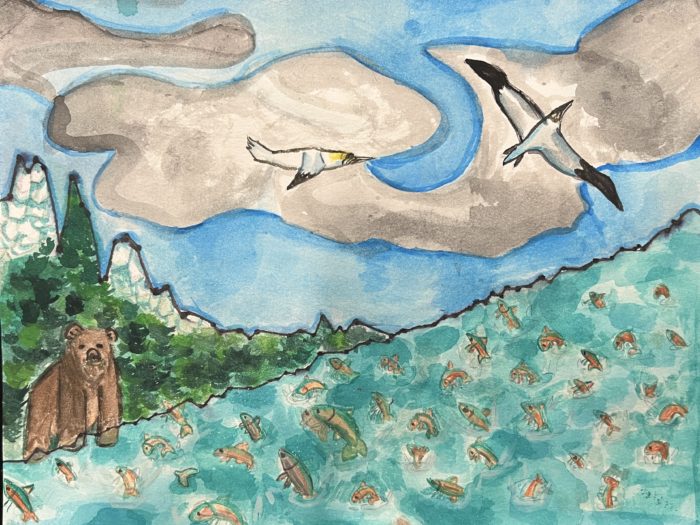
Can you spot the lines in this illustrated graph? This student incorporated both atmospheric CO2 data and Gulf of Maine sea surface temperature data in her gorgeous puffin scene.
The Science Friday lesson was inspired by the work of Jill Pelto, a trained glaciologist who uses her background in studio art to create stunning data art for science communication. Over the years, I have been fortunate to get to know Jill and nurture a partnership. I engage students in a See, Think, Wonder routine with some of her data art as a way to launch the lesson. Students are always impressed with the care and technical skill evident in Jill’s captivating watercolors. Jill has also graciously video chatted with my classes—talking us through her illustrated graph process in order to prepare students for their own.
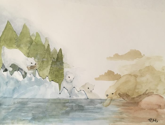
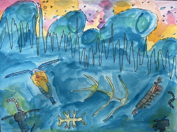
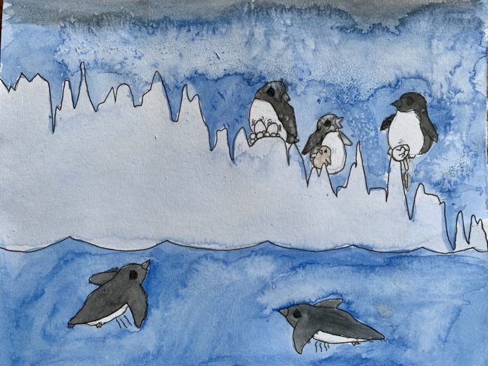
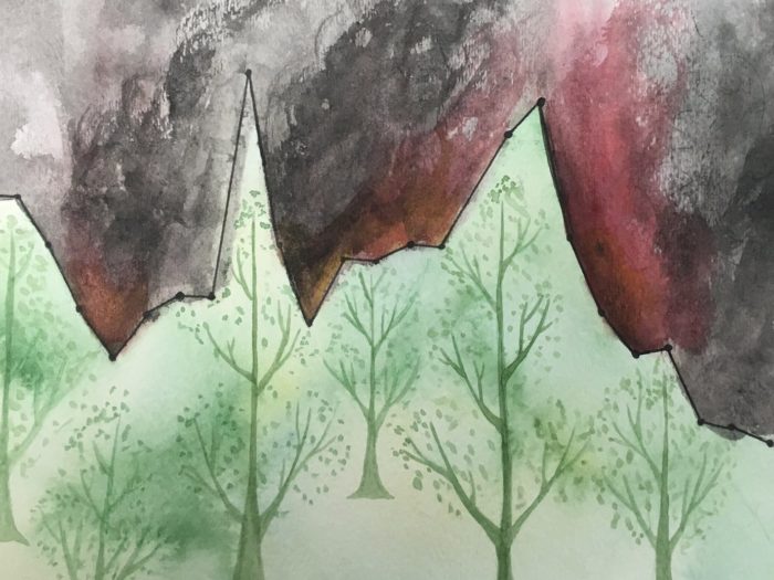
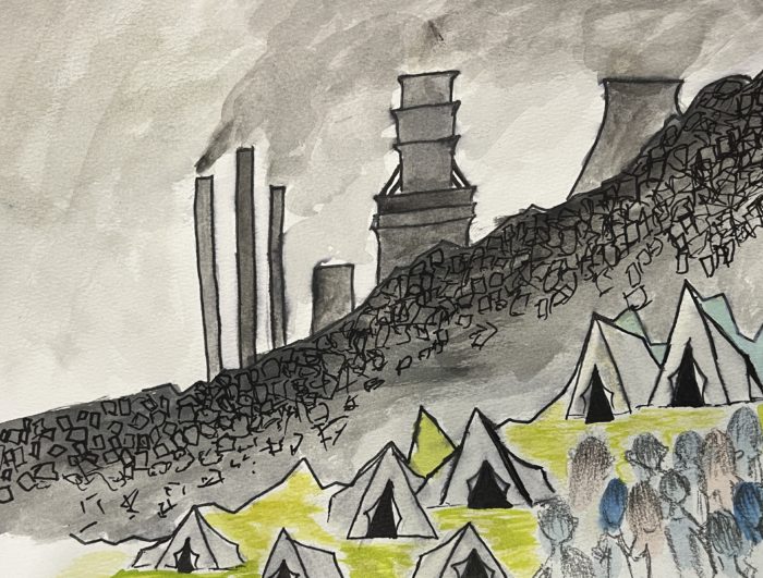
This incredible watercolor includes Arctic sea ice yearly minimum data. The stirring artwork highlights the negative impacts of Arctic sea ice decline on polar bear ecology.
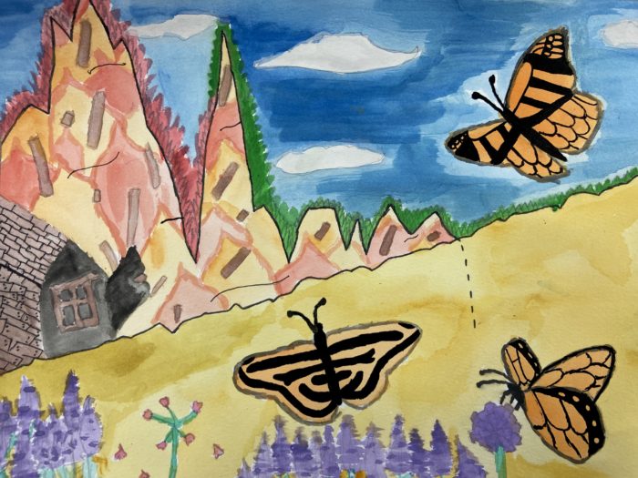
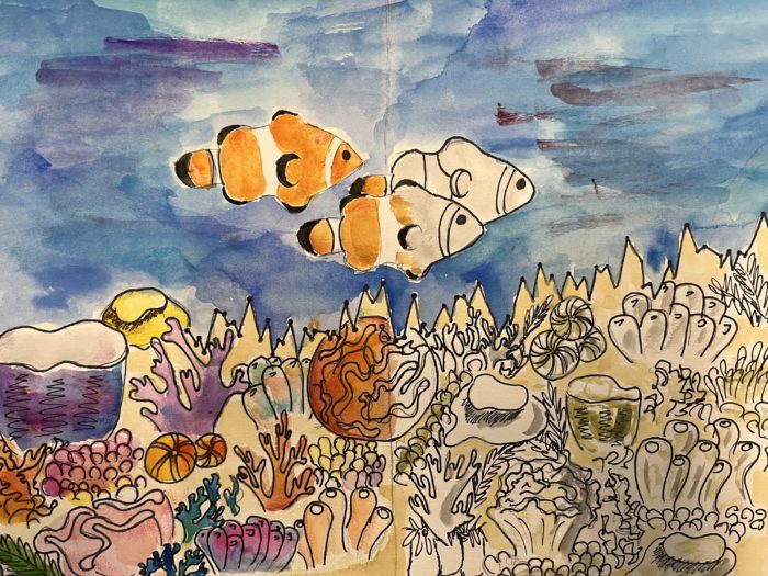
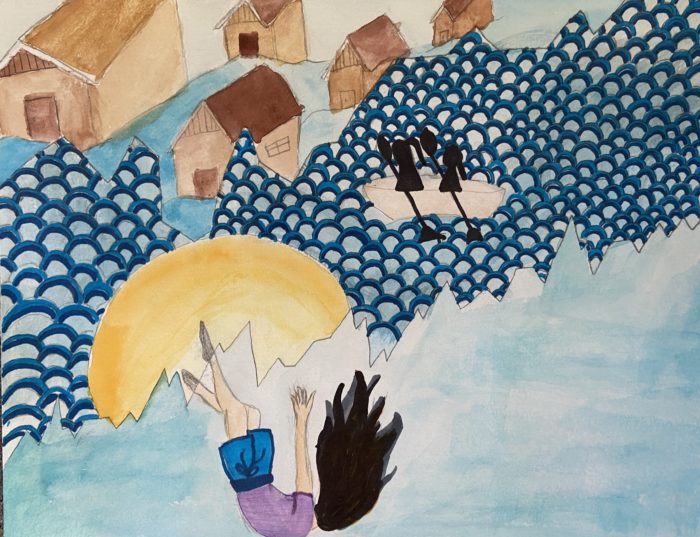
Indeed, even though the finished artwork may be impressive, the process is even more important than the final product. First, students brainstorm and decide on a topic that they are interested in. Second, they flex their research skills by taking notes from a variety of sources. Students have investigated a range of topics related to climate change for their illustrated graphs: pollinator population decline, sea level rise in Florida, coral reef bleaching events, wildfires in the Pacific Northwest, ocean acidification, and so many more! Next, students select a graph, or multiple graphs, that relate to their topic to incorporate in their artwork.
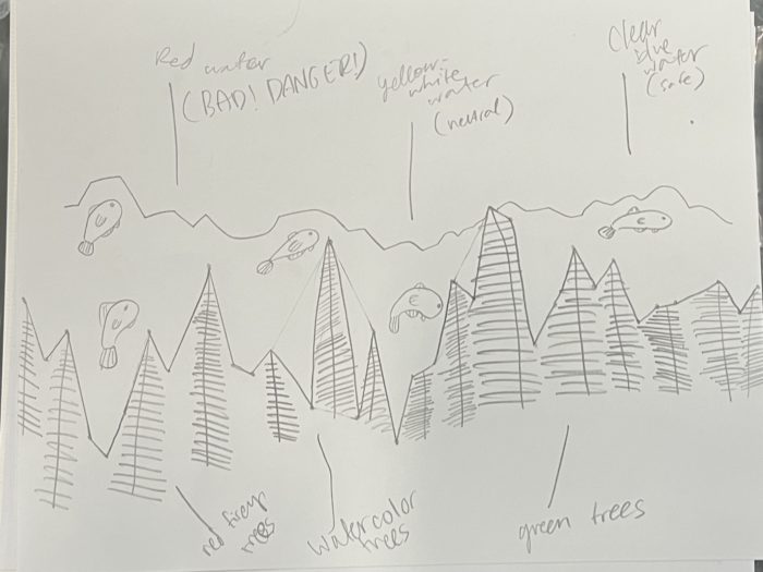
During the Illustrated Graph project, I have students document their progress. They record brainstorming of topics, research notes, and various preliminary sketches like the one shown here.
Students often use NOAA’s Global Climate Dashboard to find graphs to illustrate. On that site, there are data sets for various climate change indicators such as annual greenhouse gas index, yearly glacier ice mass balance, global sea levels, average sea surface temperatures, etc. I make sure to model a graph analysis protocol with the whole class before students try it on their own. Graphs themselves tell stories, and it is essential that students gain skills in interpreting them. The artwork that will be illustrated by students enhance the story of a graph and add a layer of emotional appeal.
The process continues with students planning for their original artwork through preliminary sketches, including decisions about how they will incorporate the graph line(s). Students can compose a realistic scene or something more abstract. Then, students transfer the graph line(s) onto a piece of watercolor paper. Many students opt to trace it, but I have found the easiest way is to print a paper-sized copy of the graph and cut along the line to make a stencil. Students use watercolors to create their illustrations, but I have also had students experiment with various media including digital art and a collage of magazine pictures. This lesson could also be a great opportunity to collaborate with an art teacher.
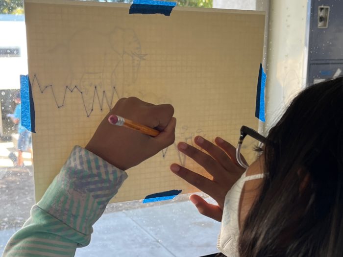
It is important that students transfer an accurate graph line into their artwork. Here, a student traces the line onto watercolor paper using the window for illumination.
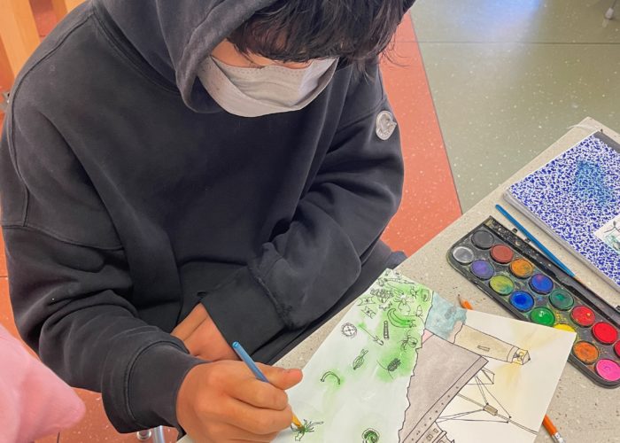
A student works on his watercolor of marine plankton. Students often use pen and/or colored pencil for the graph line(s) and other details that they want to stand out
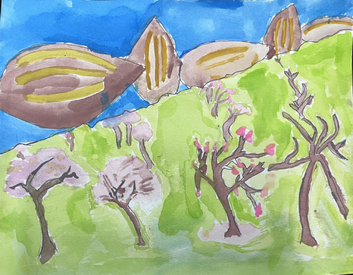
To accompany their illustrated graph artwork, students use their research notes to craft an essay about their topic. Students summarize the science of the climate change impact they depicted, explain the artistic choices they made, and describe any personal connections to the topic. Even if the subject is bleak, students’ essays always include a hopeful message of potential solutions. When complete, the diversity and power of the climate data art makes a beautiful exhibit at school or another venue. Below, you can view additional extraordinary student work from this lesson.
One of the central aims of my science curriculum is to empower students as science communicators; I want them to share accurate scientific information in creative ways. The Illustrated Graph and similar projects encourage student wonder, and they allow students to explore the intersection of art and science.


 Cristina Veresan (M.Ed.) teaches 5th grade science at the Nueva School in Hillsborough, CA. She sailed as a Teacher at Sea in 2015 aboard the NOAA Ship Oscar Dyson. She welcomes any questions about this blog via email and you can learn more about her teaching at www.veresan.com.